
You are using an out of date browser. It may not display this or other websites correctly.
You should upgrade or use an alternative browser.
You should upgrade or use an alternative browser.
There will be tweaking!
- Thread starter mjp
- Start date
Hmmm, asking for shit. Good on you!
Anyway, thanks for taking the time to update things - I do trust you know how to keep things in the best shape possible and that's an important service to those of use here. My only other comment for now is that this looks a bit like 2004 forums I stumble on after a google search (maybe it's just the font and spacing format - or maybe I just hate change like any other human). Willing to take things as they come.
Thanks again, mjp.
mjp
Founding member
The year 2004 or the number 2004?this looks a bit like 2004 forums I stumble on after a google search.
It's never going to be cutting edge, design-wise, because the good folks at vBulletin don't seem to give a shit about that kind of thing.
bospress.net
www.bospress.net
Is there a "Who is online" button that I'm missing?
Also, I noticed that links are showing up in the same font, and are not underlined in blue. I'm not sure if this can be tweaked, but it makes it harder to see a link.
Bill
Also, I noticed that links are showing up in the same font, and are not underlined in blue. I'm not sure if this can be tweaked, but it makes it harder to see a link.
Bill
cirerita
Founding member
Is there a "Who is online" button that I'm missing?
It's under "Quick Links"
bospress.net
www.bospress.net
Thanks!
The forum looks good. It'll take a bit of time to get used to it, but it looks good.
Bill
The forum looks good. It'll take a bit of time to get used to it, but it looks good.
Bill
number6horse
okyoutwopixiesoutyougo
It looks brighter and fresher, like someone took a rag and Windex to my screen.
Which is a good thing.
Which is a good thing.
mjp
Founding member
I will check into it.is there any way to remove or hide the "subscribe to this forum" and the "RSS feed" icons?
Yeah, that's not cool. I'll fix it so they are underlined again.I noticed that links are showing up in the same font, and are not underlined in blue.
Lolita Twist
Rose-hustler
It looks wide - though maybe that's just my computer setting. The only thing that bothers me though is that I have no user CP - therefore have no idea where I am. Otherwise, cheers. Good job.
mjp
Founding member
The thread display does not have the left side navigation, so it is wider when you are inside a thread. But there's no way to force the navigation onto these pages yet.It looks wide...
"Settings" - upper right.I have no user CP - therefore have no idea where I am.
mjp
Founding member
It looks like all the reply + quote methods default to "quick reply."
If you click "Reply to Thread" you should get the full editor, or click "Go Advanced" when the quick reply box is open.
---
Hmm, now that I look at it you always have to click "Go Advanced" to get the full editor.
---
Except when using multi-quote.
---
Or something.
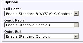
In any event, here's how the controls are set up, and they were the same before the upgrade:

If you click "Reply to Thread" you should get the full editor, or click "Go Advanced" when the quick reply box is open.
---
Hmm, now that I look at it you always have to click "Go Advanced" to get the full editor.
---
Except when using multi-quote.
---
Or something.
In any event, here's how the controls are set up, and they were the same before the upgrade:
Attachments
bospress.net
www.bospress.net
the smileys don't show up...
Thanks be to Jeebus.
The year 2004 or the number 2004?
It's never going to be cutting edge, design-wise, because the good folks at vBulletin don't seem to give a shit about that kind of thing.
I think it's mainly the font in the posting window, but the overall structure and content is great. So far I've been able to find everything fairly easily.
Good job!
Gerard K H Love
Appreciate your friends
I like it! Especially the way you can see back through the web cams of everyone when you go to the who's on line page. Some of you need to wear more clothes.
The new layout SUCKS big time.
It's only beaten by how the new handling sucks.
Or maybe not even by that.
no, just honesty.
The stupid BIGNESS of the symbols and the fonts, like if we were little children. Like the stupid comic-layout on recent operating systems. It's not mjps fault, it's just how screens are designed these days. I hate it.
And this wiiiiide screen minus the menu to the left. How will we tell newbies about the poem-database now?
And the superfunny speech-bubble-blurbs to mark quotations! ARRRRGGH!
It's only beaten by how the new handling sucks.
Or maybe not even by that.
Is that German for "thanks, mjp?"
no, just honesty.
The stupid BIGNESS of the symbols and the fonts, like if we were little children. Like the stupid comic-layout on recent operating systems. It's not mjps fault, it's just how screens are designed these days. I hate it.
And this wiiiiide screen minus the menu to the left. How will we tell newbies about the poem-database now?
And the superfunny speech-bubble-blurbs to mark quotations! ARRRRGGH!
Bukfan
"The law is wrong; I am right"
I liked the old layout better, but I guess there was no way around updating the site.
Too bad there wasn't room for the pic of Buk in the train freight car.
I had a look at my profile, and on top of the message box it says, "Visitor Messages - About Me - Friends", but you can only see the upper 1/3 of the letters. I hope mjp or the mods can correct it.
When I click on "New Posts", and it says there are'nt any, I can get to see the posts from the last 24 hours if I click on the link, but in the old forum I got to see a list of all the threads I had'nt read since new posts were made in them. For instance, yesterday when I clicked on "New Posts" in the old forum, I had yet to read the new posts in forty-something threads, but now I can only get to see 18 threads from the last 24 hours, some of which have'nt any new posts for me to read. Is there a way I can get a list over all the threads which contains posts I have'nt read yet?
Last edited by a moderator:
To be fair, mjp has done a good job so far of approximating the old style forum with the new software.
But it seems to me that the developers really haven't considered how drastic the changes would be for existing sites to implement. Sites like this, where the forum is pretty central to the whole place, well it makes no sense to completely rearrange and restyle it. Give us options to restyle and restructure sure, but force us to have a completely new layout? Not very clever of them.
But as mjp has said above, you either update or you get left behind without crucial security patches etc.
Bah. We'll get used to it, just in time for the next big update.
I don't get you.When I click on "New Posts", and it says there are'nt any, I can get to see the posts from the last 24 hours if I click on the link, but in the old forum I got to see a list of all the threads I had'nt read since new posts were made in them. For instance, yesterday when I clicked on "New Posts" in the old forum, I had yet to read the new posts in forty-something threads, but now I can only get to see 18 threads from the last 24 hours, some of which have'nt any new posts for me to read. Is there a way I can get a list over all the threads which contains posts I have'nt read yet?
On my screen it shows the same as the old lay-out.
Or- I just don't see any differences... It's all good, give it a chance and some time.
Last edited by a moderator:
bospress.net
www.bospress.net
Yeah, just remember, no one ever LOVES program changes. We are used to it and like it the way that it was. I'll never forget the complaints when, years ago, at the hotel that i worked at, we changed from a DOS based to a windows based program. Near Mutiny. Complaints everyday... After a couple months, they could not see doing it the old way.
Bill
Bill
cirerita
Founding member
I will check into it.
Thanks, man.
I'll fix it so they are underlined again.
sneaky self promoting bastard!
that's something I would do.